Calligraphy: When Letters Become Pure Form
How does calligraphy strip the letter of its role as a servant to meaning and elevate it into a form of its own?
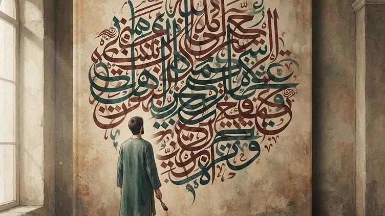
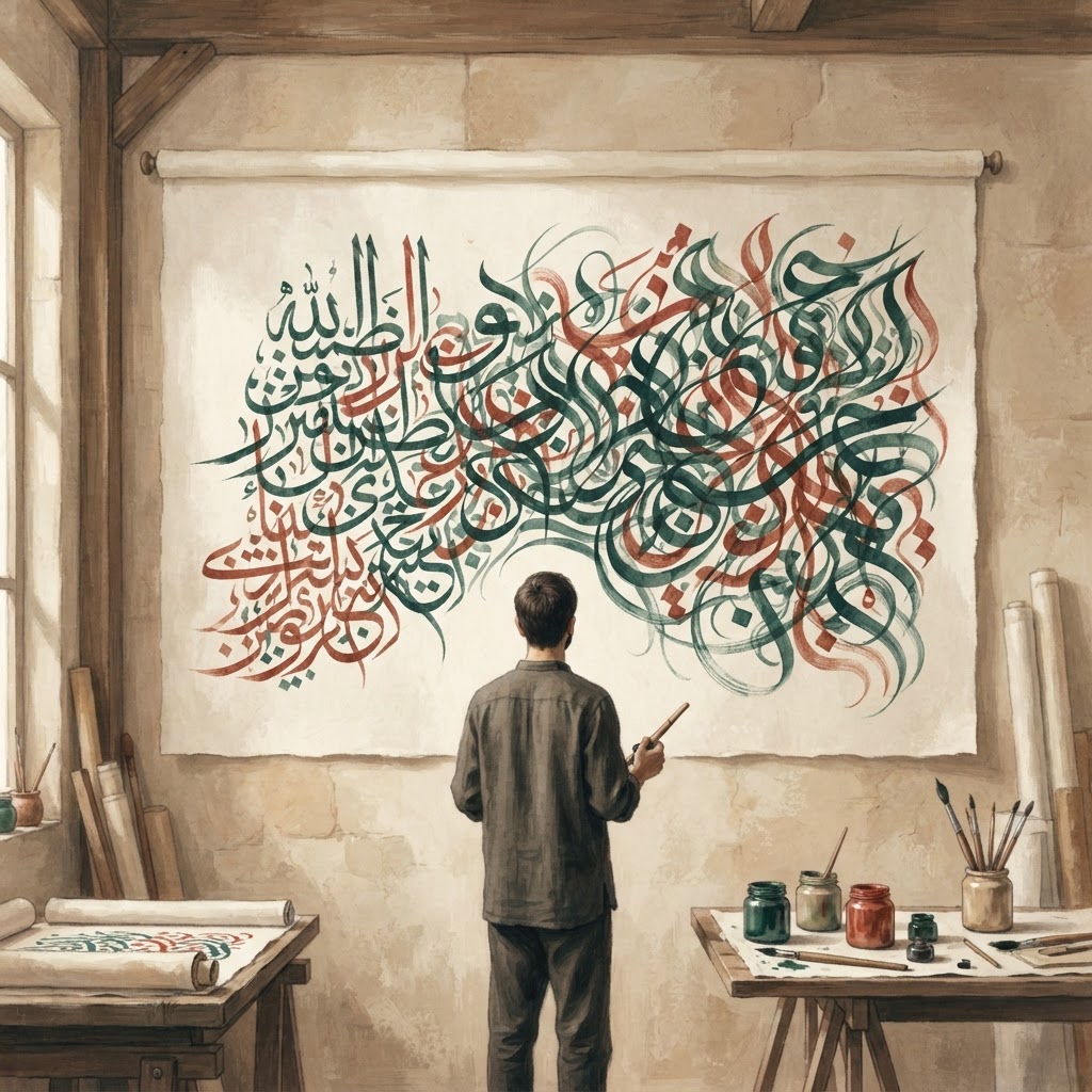
Staring long at a single letter is an act that rarely crosses our minds. Letters serve us daily, carrying meaning and representing sound before vanishing from our notice. Yet, standing before a piece of calligraphy, something strange occurs: the letter is no longer there to be read, but instead invites you to look at it. This minor peculiarity opens the door to a profound question. Can writing exist as mere form, setting meaning aside? And if so, how does this alter our relationship with language, sight, and beauty? The art of calligraphy behaves as if it exists to answer this, liberating the letter from the service of meaning to become an independent form. ## The Letter as a Shape First Each letter in the alphabet was invented to represent a sound. In the hands of a master calligrapher, however, the letter seems to forget this duty. The vertical stroke of an elif, the curve of a vav—these emerge on the page first as a matter of balance, proportion, and negative space. Before writing, the calligrapher considers how the letter will stand, the angle at which it will touch the paper, and the rhythm it will establish with its neighbors. This is not a linguistic concern, but a pictorial one. The letter is born as a shape before it is bound to a sound or a meaning; the moment preceding that binding is the true focus of calligraphy. One might object: does not every form of writing carry an aesthetic concern? Even a typeface has a font and character. True, but the difference lies in intent. A typeface is designed to maximize readability; its beauty is hidden behind its function. In calligraphy, the relationship is inverted. Beauty comes to the fore, and function recedes. A basmala written in thuluth script stands there not to be read, but to be beheld; the act of reading follows as a consequence of the act of looking. This inversion is the essential character of calligraphy and marks the boundary between it and mere penmanship. ## Unreadability Is Not a Flaw The first reaction of someone encountering Celi script is usually astonishment. So large and exaggerated are the lines that they entwine, sometimes making it difficult to identify a single word. In intricate compositions, this goes further; letters merge and weave like knots, and the viewer looks not to decipher the text, but to admire the beauty of the knot itself. A question arises: is this a deficiency or a conscious choice? The answer lies in the logic of art. The decrease in legibility is not a flaw slipping from the calligrapher’s hand; rather, it is a price paid to increase aesthetic intensity. To understand this, consider a musical analogy. Does a melody become worse as its lyrics lose clarity? Sometimes the opposite occurs; the sound becomes detached from the meaning of the word and wraps around us with its own musicality. A similar phenomenon occurs in calligraphy. As the letter loses its readability, it gains visual intensity. This is not a loss, but a transformation. The large, exaggerated lines of Celi script are noticeable even from a distance when placed on an architectural facade, yet they are never expected to be read at close range. Intricate writing is valued as a demonstration of mastery; the viewer does not wonder what it says, but how it was made. Unreadability is not a failure here, but an invitation: an invitation to look, to admire, and to dwell with an unsolved riddle. ## The Letter Transforms into Space and Body The most striking moment in calligraphy is when the letter leaves the paper. Positioned on a mosque dome, a door lintel, or a fountain stone, the writing is no longer a text to be read but a part of the architecture. Spread across a surface, calligraphy transforms the letter into a three-dimensional experience; one walks past it, beneath it, and alongside it, forming a different relationship from every angle. While such a letter continues to carry meaning, its primary task is now to provide rhythm, texture, and depth to the space. Here, writing enters the same language as architecture; it becomes one with the stone, plaster, and mosaic. An even more striking example is zoomorphic compositions. In these works, where letters merge to form the shape of a bird, a lion, or a ship, writing moves closer to painting. The letters of a word become the wing, beak, or body of a bird; the viewer first sees an animal, then realizes it is actually a prayer or a name. This dual-layered visual experience is perhaps the most daring aspect of calligraphy. Here, the letter is willing to hide its own identity, accepting to appear as something else entirely for a moment. This is the extreme point of the letter’s liberation from meaning; by turning itself into a body or a form, writing transcends the boundaries of language. This transformation shows us how flexible a material language truly is. While the letter remains a sign representing sound, it also multiplies as an independent visual entity. This dual existence keeps the viewer oscillating between two reading modes: one moment trying to decipher the text, the next simply looking at the form. This back-and-forth is the most subtle relationship calligraphy establishes with the viewer; it is neither a pure linguistic experience nor a pure pictorial one. It is a third state, suspended between the two. Perhaps what calligraphy teaches us is that meaning alone is insufficient. A letter, a word, a sentence tells us something not only through its message but through its appearance. Writing that becomes unreadable as it becomes beautiful confronts us with the two powers of language: the power to narrate and the power to show. Calligraphy succeeds in harboring both powers simultaneously within the same line, and this success transforms the letter from a mere communication tool into a mode of existence. The state of gentle bewilderment we feel when standing before a piece we cannot read is perhaps exactly this: falling into the deepest, most silent beauty that language has to offer.
İlgili Denemeler
Ralph Lauren: From Bronx to American Aristocracy
The true story of Ralph Lauren reveals how a non-existent aristocratic past was successfully transformed into a global fashion empire.
Ecce Homo: How a Failed Restoration Became a Hit
A century-old fresco in a small Spanish town was transformed into an entirely different work during an amateur restoration, ultimately changing the town's fate.
Anish Kapoor and Vantablack: Art's Color Monopoly
Anish Kapoor's monopoly over Vantablack reignited debates on artistic ownership, authenticity, and whether colors can be confined to a single creator's signature.
Tartışma (0)
Henüz yorum yok. İlk yorumu siz yapın.
Join the Newsletter
New essays, once a week, delivered to your inbox.